Business Cards
(Under Construction for Final)
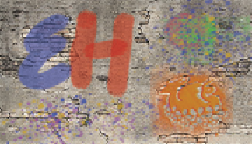
For these business cards, I took inspiration from the logos I had created as well as aspects of my own personality to create what I felt are fitting personal post cards. The top card was created primarily with photo shop, taking advantage of various paint brushes to get that graffiti-spray look, utilizing a variety of bright colors to create a chaotic and energetic appeal. I put the info in the white box to contrast with the surrounding colors and make it more readable, but also to add some visual balance to the back.
The second card is much more subtle, but still a bit extravagant. I really wanted to employ the use of the shape tool in Indesign to create a honeycomb effect, because bees and honey are something that I often think of in relation to myself. I then used a rectangle gradient to get the background effect. Through placing the black logo and black honeycomb accents on the back, I wanted to create contrast and balance overall, and to give myself an excuse to play around with the emboss tool.
The last card is probably my favorite. Using one of my logos that already had the purple, blue, and pink color scheme, I used those same colors throughout the card to create cohesion, but used a juxtaposition between geometric and organic shapes to maintain interest. Once again, I had a little bit too much fun with the emboss tool.


Comments
Post a Comment