Posts

Showing posts from October, 2020

A pop of color

Image
For this project, I took an image that had a view core colors that I knew would showcase the manipulated colors well. I created this project using a combination of the magnetic select tool, the adjustment layer tool, and the gradient tool. The black and white image was the easiest to complete, and the contrast between the values gave me inspiration on where to place the altered colors to make them best stand out. Instead of just choosing random color schemes, I decided to extract color themes from images that held personal meaning.  The top image (reds, blues, and oranges) was taken from a sunset image of sunflowers that I took back  in Hawaii. Sunflowers are my favorite plant, and I enjoy embedding ties to my home in my artwork as I feel it adds a personal touch and makes it more meaningful. I enjoy the way that the warm and cool colors starkly contrast in this image to create a bold effect.  The second image (greens and oranges) are a compilation of my favorite colors, ...

Photoshop Tutorials

Trying to learn Photoshop? These videos are a great place to start! Learn Photoshop in 5 Minutes! Beginner Tutorial! by FlowGraphics  https://www.youtube.com/watch?v=KAmSB5MQxOo  This video was a great one to start off with, as it set up all the basics for what photoshop has available to its users. It goes over things such as how to adjust an image, how to use basic effects, and how to adjust colorization. In addition, this video contains helpful tips such as knowing the difference between saturation and vibrancy (vibrancy increasing saturation in ever color except for skin tones.) It looks like the setup of the program are fairly similar to the mechanics of adobe illustrator, which makes me feel fairly confident in my ability to learn how to use photoshop.  How to use a layer mask? Photoshop CC Tutorial for Beginners https://www.youtube.com/watch?v=NxxPUKrKcmE Using a layer mask is an essential tool for photoshop, and this was a fairly thorough tutorial that gave the bas...

E hō mai ka ʻike mai luna mai e

Image
  My Propaganda Self-Portrait Poster, created in Adobe Illustrator,  was inspired by a current issue in Hawaii regarding the ongoing Coronavirus pandemic. Despite the rampant spread of COVID-19, and the almost complete shutdown of the Hawaiian islands due to it, tourists still insist on flying out for a vacation. While this in itself isn't an inherently negative thing, recently they have been neglecting to follow basic guidelines such as wearing a mask, obeying the two-week quarantine, or getting tested before flying out.  This issue is exacerbated further by the historic disrespect tourists have had not only for the  āina  but for the  Kamaʻāina, treating the islands as nothing more than a vacation spot designed for their pleasure. This is why I included "Our  āina is not your playground," along with "spread Aloha, not Covid." I used naturalistic colors to reflect the natural beauty of the islands, and the feather effect to soften the colors of the sh...

This is Me in No Words At All

Image
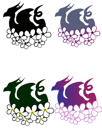
       My logo is a culmination of various character traits that I see in myself, but also has several other personal touches. The original design consists of a dragon surrounded by a hoard of plumerias.       Dragons not only represent adaptability and ambition, but also reflects what I perceive to be my main strength: input, the tendency to collect and hoard everything from knowledge to relationships. In addition, I grew up with a childhood passion for dragons, staunchly refusing to believe that they weren't real creatures until the fourth grade. Because of this, they hold a soft spot in my heart, leading me to use them for my personal logo. The plumerias symbolize kindness and positivity, as well as to serve as a reference to my home state of Hawaii. A more hidden feature of my design is that my initials are hidden into the logo, with the tail forming an 'E,' the wings forming an 'M,' and the horns forming an 'H.'      While my l...

This is Me in So Many Words

Image
  In this self portrait, I feature two sides of myself, the part that is openly displayed to others and the parts of me that are a little bit harder to see at first glance. On the left side,  I wrote a letter about myself*, detailing out things that popped in my head as defining character traits to affirm my identity and make a point to my future self about not just how I see myself, but who i am at my core.. I then used this text and warped it in the outline of my face using envelope distort,, and then added on a few of my defining facial features. My eyebrows are created using parentheses, my lips are “C’s” and “P’s,” and my nose is made of one single letter “P.” My hair is created from descriptors used for my actual hair (“Curly and straight and thick and frizzy and brown and gold and mine”) as well as the repeated letter “g” for the tendril.    However, I did not depict my eyes on the left side, choosing instead to represent them on the right with the blue/g...