E hō mai ka ʻike mai luna mai e

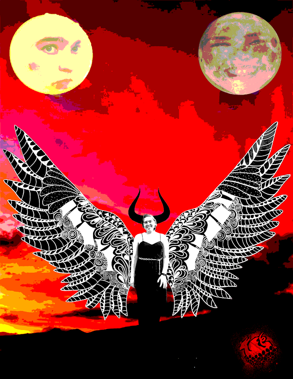
My Propaganda Self-Portrait Poster, created in Adobe Illustrator, was inspired by a current issue in Hawaii regarding the ongoing Coronavirus pandemic. Despite the rampant spread of COVID-19, and the almost complete shutdown of the Hawaiian islands due to it, tourists still insist on flying out for a vacation. While this in itself isn't an inherently negative thing, recently they have been neglecting to follow basic guidelines such as wearing a mask, obeying the two-week quarantine, or getting tested before flying out. This issue is exacerbated further by the historic disrespect tourists have had not only for the āina but for the Kamaʻāina, treating the islands as nothing more than a vacation spot designed for their pleasure. This is why I included "Our āina is not your playground," along with "spread Aloha, not Covid." I used naturalistic colors to reflect the natural beauty of the islands, and the feather effect to soften the colors of the shadows.
I absolutely love your poster! The message it sends is very important and the slogan is very memorable and catchy. The color palette is very beautiful and gives a tropical and beachy vibe. The larger text is nice and easy to read, but the smaller text near the flower is harder to read so you could try to play with more fonts and colors for that text. I also like the soft light your created in your illustration, it goes very well with the naturalistic theme of your poster. Beautiful job!
ReplyDeleteThis is a fantastic poster with a great message. I love the message you are trying to spread. It is very important to keep the wold clean and in this case Hawaii. I love the colors you chose to use. I particularly love the natural glow effect that you created. This makes it seem like you're standing near the sunset and thats the affect it has on your skin. I love how this looks. It is very beautiful. Amazing job
ReplyDeleteYou did an amazing job with this project. The layout works really well, everything's is framed nicely and you can easily read and view every element in the poster. Your line and color work is also very nice; you were able to make yourself look very realistic in an illustrated manner (shadows, gradients, etc) and everything looks very clean. Nice job!
ReplyDeleteThis was a super successful project in my opinion. I love the color scheme and message. You also have a lot of great gradients throughout which definitely give more depth to the different elements in the poster. I also think you chose a really great message that is important to you, and your poster definitely shows that successfully!
ReplyDelete